Optimizing your Squarespace Site Navigation

A website's success depends heavily on the user experience (UX) it provides.
It is not just about creating an appealing website with top-quality content. If visitors struggle to navigate the site, they are likely to leave before exploring what it has to offer.
Squarespace’s site navigation can help you prevent this issue.
FOR YOU NOT TO GET LOST:
Squarespace one of the msot popular website builder - and for good reason! It’s popularity has grown so much because of their several features to help create a professional-looking website without requiring coding expertise. One of its significant features is site navigation.
We will in this blogpost teach you how you can optimize your Squarespace site navigation to enhance your website's UX (User Experience shortened for the ones not fluent in web design jango).
One of the key ways to improve your website's UX with Squarespace site navigation is to ensure that your navigation menu is well-organized and easy to use. This entails grouping related pages together, avoiding clutter by limiting the number of menu items, and using descriptive and concise labels for each menu item to provide clarity to your visitors.
Another essential aspect of site navigation is the use of breadcrumbs. Breadcrumbs are a form of secondary navigation that shows the path a user has taken to reach the current page. They can be especially helpful for visitors who landed on your site through a search engine or a social media post, as breadcrumbs indicate where they are and how they can navigate to other pages on your site.
Besides these techniques, there are other ways to optimize your Squarespace site navigation to enhance your website's UX. These include adding search functionality, creating a sitemap, and using internal links.
By implementing these strategies, you can ensure that your visitors have a seamless and enjoyable experience on your website, leading to increased engagement and conversions.

Why Squarespace Site Navigation Matters
Your website's navigation is the backbone of your site's user experience (UX). It is an essential element that can make or break your website. In fact, good navigation can turn a casual visitor into a loyal customer. Here are a few reasons why Squarespace site navigation matters:
It provides a clear and organized structure for your website, making it easy for visitors to find what they need. This can include clear labels, drop-down menus, and easy-to-understand categories.
It helps keep your visitors engaged with your website. By offering a smooth and seamless navigation experience, visitors are more likely to stay on your site and explore what you have to offer.
It contributes to search engine optimization (SEO) by making it easy for search engines to crawl your site. When your site has organized and well-structured navigation, it can help search engines understand the content and hierarchy of your website, making it more likely to rank higher in search results.
Additionally, well-designed navigation can enhance your website's overall aesthetic and branding. By incorporating your brand colors and fonts, you can create a cohesive look and feel that reinforces your brand identity.
How to Optimize Your Squarespace Site Navigation

Now that you know why Squarespace site navigation is important, let's look at some ways you can optimize Squarespace site navigation to enhance your website's UX.
We cover topics like keeping navigation menus well-organized, using breadcrumbs, adding search functionality, creating a sitemap, using internal links, and more. By implementing these strategies, you can ensure that your visitors have a seamless and enjoyable experience on your website, ultimately leading to higher engagement and conversions.
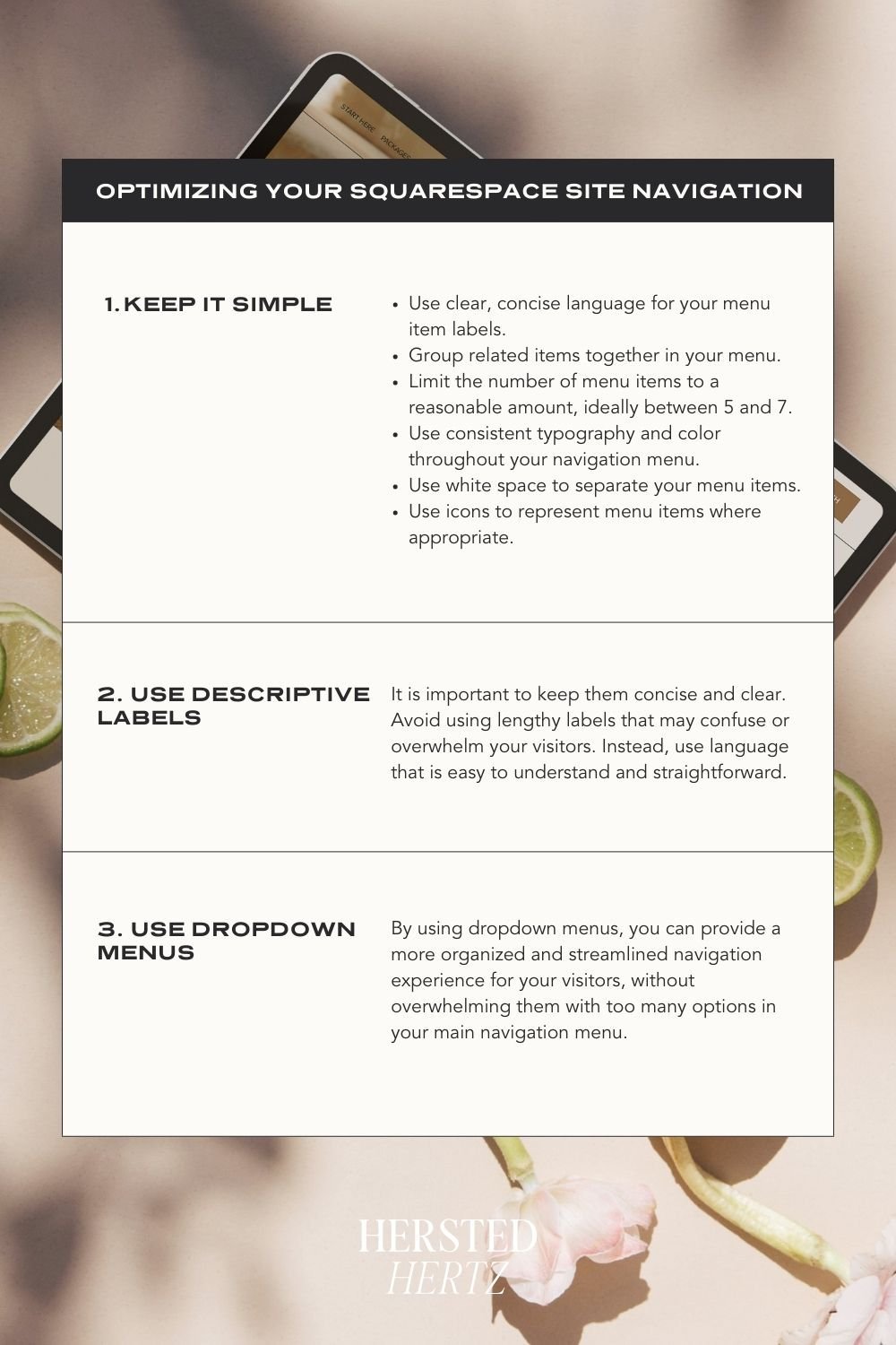
1. Keep It Simple
When it comes to Squarespace site navigation, simplicity is key. A good navigation system should allow your visitors to find what they need quickly and easily.
This can be achieved by keeping your navigation menu simple and easy to use. Here are some additional tips to help you simplify your Squarespace site navigation:
Use clear, concise language for your menu item labels. This will help your visitors understand what each item leads to and make it easier for them to find what they are looking for.
Group related items together in your menu. This will make it more intuitive for your visitors to navigate through the site and find what they need.
Limit the number of menu items to a reasonable amount, ideally between 5 and 7. By having too many options, visitors may become overwhelmed and confused, leading them to leave the site.
Additionally, it is important to consider the visual design of your navigation menu. A clean and organized menu can help visitors navigate your site more easily. Here are some design tips to keep in mind:
Use consistent typography and color throughout your navigation menu. This will help your visitors visually understand the hierarchy of your menu items.
Use white space to separate your menu items. This will make it easier for visitors to visually distinguish between each item.
Use icons to represent menu items where appropriate. This can help visitors understand what each item leads to at a glance.
By following these tips, you can create a user-friendly navigation system that will help your visitors have a positive experience on your Squarespace website.
2. Use Descriptive Labels
When designing your website, it is important to use clear and descriptive labels for your menu items. Your menu labels should not be vague and generic, like "Products" or "Services". Instead, use labels that clearly describe what your visitors will find when they click on the menu item.
Descriptive labels not only help visitors navigate your site more easily, but they also provide a better user experience. By using descriptive language, you are providing your visitors with more information about what they can expect to find on each page. This helps build trust and confidence in your website, which can lead to higher conversion rates and increased customer satisfaction.
Consider using labels that are specific to your business, such as "Shop Our Products," "Browse Our Catalog," or "View Our Collection." These labels provide more information to your visitors and give them a better idea of what they can expect to find when they click on the menu item.
Similarly, if you offer a range of services on your website, consider using labels like "Explore Our Services," "Learn About Our Offerings," or "Discover Our Solutions." These labels are more descriptive and informative than generic labels like "Services" or "Solutions."
When using descriptive labels, it is important to keep them concise and clear. Avoid using lengthy labels that may confuse or overwhelm your visitors. Instead, use language that is easy to understand and straightforward.
Overall, using descriptive labels for your menu items is an important part of creating a user-friendly website. By providing your visitors with clear and informative labels, you can help them navigate your site more easily and improve their overall experience.
3. Use Dropdown Menus
Dropdown menus are a great way to group related pages under a single menu item, making it easier for visitors to navigate your website. By using dropdown menus, you can provide a more organized and streamlined navigation experience for your visitors, without overwhelming them with too many options in your main navigation menu.
To make the most of dropdown menus, it's important to use clear and descriptive labels for your menu items. Instead of using vague labels like "Products" or "Services", use labels that clearly describe what your visitors will find when they click on the menu item. For example, instead of "Products", you could use "Shop Our Products" or "View Our Collection". This makes it clear to your visitors what they'll find when they click on the menu item.
Another tip is to limit the number of menu items to 5-7. This helps keep your navigation menu simple and easy to use. If you have more than 5-7 menu items, you can use dropdown menus to further categorize your pages.
For example, if you have a "Services" menu item, you can create a dropdown menu for "Web Design" that includes pages for "E-commerce Design," "Responsive Design," and "UX/UI Design." Similarly, a "Marketing" menu item could have a dropdown menu with pages for "Email Marketing," "Social Media Marketing," and "SEO."
By using dropdown menus, you can provide a more organized and streamlined navigation experience for your visitors, without overwhelming them with too many options in your main navigation menu. This can help improve your website's user experience and make it easier for visitors to find what they're looking for.
Overall, using dropdown menus is a simple yet effective way to improve your website's navigation and make it more user-friendly. By taking advantage of this feature, you can provide a better experience for your visitors and increase the chances of them becoming loyal customers.
4. Use Breadcrumbs
Breadcrumbs are a type of navigation that show your visitors where they are on your website. They usually appear at the top of a page and show the path the visitor took to get to the current page.
Breadcrumbs are an important tool to help your visitors navigate your website. They provide a clear path to the current page and help your visitors understand where they are on your website.
For example, if your visitor started on your homepage and clicked on "Shop Our Products", the breadcrumb might look like this:
Home > Shop Our Products > Product Category > Product Name
Breadcrumbs can also be a great way to improve your website's usability. By providing a clear path to the current page, your visitors are less likely to get lost or confused as they navigate your site. This can lead to increased engagement and a better overall user experience.
In addition to helping visitors navigate your site, breadcrumbs can also improve your website's search engine optimization (SEO). By including keywords in your breadcrumbs, you can help search engines understand the structure of your site and improve your rankings for relevant search terms.
So if you have a large website with many pages, consider using breadcrumbs to help your visitors find their way around. Not only will they make your site easier to navigate, but they can also improve your SEO and overall user experience.
5. Make It Mobile-Friendly
More and more people are browsing the web on their mobile devices. That means your Squarespace site navigation needs to be mobile-friendly too.
Here are some tips for making your Squarespace site navigation mobile-friendly:
Use a hamburger menu: A hamburger menu is a popular way to display site navigation on mobile devices. It's a three-line icon that expands into a menu when clicked. This keeps your navigation menu out of the way until your visitors need it.
Keep it simple: On mobile devices, screen real estate is limited, so you need to keep your navigation menu simple. Limit the number of menu items and use clear, concise labels.
Make it easy to tap: Make sure your menu items are big enough and spaced out enough to make it easy for your visitors to tap on them with their fingers. You don't want them accidentally clicking on the wrong menu item because they were too close together.
Use a search bar: Including a search bar on your mobile site navigation can be helpful for users who are looking for specific content. This can also save them time by avoiding the need to scroll through numerous pages to find what they need.
Add sub-menus: If your website has a lot of pages, consider adding sub-menus to organize your content. This will improve the user experience by making it easier for visitors to find specific content.
Include footer navigation: Including a footer navigation bar can be helpful for users who have scrolled to the bottom of a page and want to navigate to other areas of your website. This can also improve the overall user experience by reducing the need for visitors to scroll back to the top of a page to find the navigation menu.
Incorporate related content: If you have related content that you want to promote, consider incorporating it into your mobile site navigation. This can encourage users to explore more of your website and can also help to improve the user experience.
By incorporating these tips, you can ensure that your Squarespace website is mobile-friendly and easy to navigate on all devices.
6. Use Calls to Action
Calls to action (CTAs) are buttons or links that encourage your visitors to take a specific action. They can be a powerful tool for improving your website's UX and driving conversions.
You can use CTAs in your Squarespace site navigation to encourage your visitors to take a specific action, such as signing up for your newsletter, buying a product, or booking a consultation.
Here are some tips for using CTAs in your Squarespace site navigation:
Use clear, action-oriented language on your CTAs.
To create effective CTAs, you should use clear, action-oriented language that communicates exactly what you want your users to do. For example, instead of using generic language like "click here," use specific language like "Sign up for our newsletter" or "Book a consultation now". This will help users understand the value of the action you're asking them to take and increase the likelihood that they'll follow through.
Make your CTAs stand out visually with color and/or design.
In addition to using clear language, it's important to make your CTAs visually stand out from the rest of your website. You can use color, design elements, and placement to draw attention to your CTAs and make them more clickable. For example, you might use a bright color like red or orange to make your CTA button pop, or use a contrasting color to make it stand out from the rest of your navigation menu.
Place your CTAs in strategic locations in your navigation menu.
Finally, it's important to strategically place your CTAs throughout your navigation menu. You might consider placing them at the top of your menu, where they'll be most visible, or at the bottom of your menu, where they'll be more likely to be seen by users who have scrolled to the end of the page. By strategically placing your CTAs, you can maximize their impact and drive more conversions on your Squarespace site.
BONUS: FAQ!
-
It's generally recommended to limit your menu items to 5-7. This helps keep your navigation menu simple and easy to use.
-
Squarespace offers a range of support resources, including documentation, forums, and live chat support. You can also hire a Squarespace expert to help you with your website.
-
There are several ways to optimize your Squarespace site navigation, including keeping it simple and well-organized, using descriptive labels, using dropdown menus, incorporating breadcrumbs, making it mobile-friendly, and using calls to action strategically.
-
Breadcrumbs are a type of secondary navigation that display the path a user has taken to reach the current page. They can be particularly useful for visitors who have landed on your website through a search engine or a social media post, as breadcrumbs give them an idea of where they are and how they can navigate to other pages on your website.
-
You can measure the effectiveness of your Squarespace site navigation by tracking metrics such as bounce rate, time on site, and conversion rate. If visitors are leaving your site quickly or not converting, it may be a sign that your navigation system needs improvement. You can also gather feedback from users through surveys or user testing to identify areas for improvement.
-
A sitemap is a file that lists all the pages on your website, organized in a hierarchical structure. This file is used by search engines to crawl your website more efficiently and to understand the hierarchy of your pages.
By creating a sitemap for your Squarespace website, you can improve your site's SEO and make it easier for visitors to find what they're looking for. Additionally, you can use the sitemap as a quick reference to ensure that all of your pages are linked correctly and that there are no broken links on your site.
-
One way to test your Squarespace site navigation is to ask friends, family, or colleagues to navigate your website and provide feedback on their experience. You can also use tools like heat maps or user testing software to track how visitors are interacting with your navigation menu and identify any areas that may be causing confusion. Additionally, you can review your website's analytics to see which pages are most frequently visited and which pages have a high bounce rate, which may indicate that visitors are having difficulty navigating your site.
-
Yes, subpages can be a great way to organize your site navigation. They allow you to group related pages together under a single menu item.
-
Squarespace site navigation refers to the menu system that allows visitors to navigate your website. It typically includes links to different pages or sections of your site, and can be customized to meet your needs.
-
Squarespace site navigation is important for user experience because it helps visitors find what they're looking for quickly and easily. A well-organized navigation system can keep visitors engaged with your site and increase the chances of them converting into customers.
-
Yes, Squarespace allows you to customize the design of your site navigation to match your branding and aesthetic. You can change the font, color, and layout of your navigation menu to make it more visually appealing and user-friendly.
-
Adding a search bar to your Squarespace site navigation allows visitors to quickly find what they're looking for by searching for keywords. This can be especially helpful for visitors who may not be familiar with your website's navigation structure. By using a search bar, visitors can easily find specific pages, products, or information without having to navigate through multiple pages on your website.
-
Internal linking refers to the practice of linking to other pages on your website within your content. By including links to related content throughout your website, you can create a more cohesive user experience and help visitors find the information they need more easily. Internal linking can also improve your site's SEO by helping search engines understand the relationships between different pages on your website.
Your Squarespace site navigation is an essential part of your website's UX. It's how your visitors move from one page to another and find what they need. Optimizing your site navigation can improve your website's UX and keep your visitors engaged.
Remember to keep your navigation menu simple, use clear and descriptive labels, and make it mobile-friendly. Use calls to action strategically to encourage your visitors to take specific actions.
By following these tips, you can create a Squarespace site navigation that's easy to use, engaging, and drives conversions.
RELATED:
If you liked this post, Pin it to Pinterest!