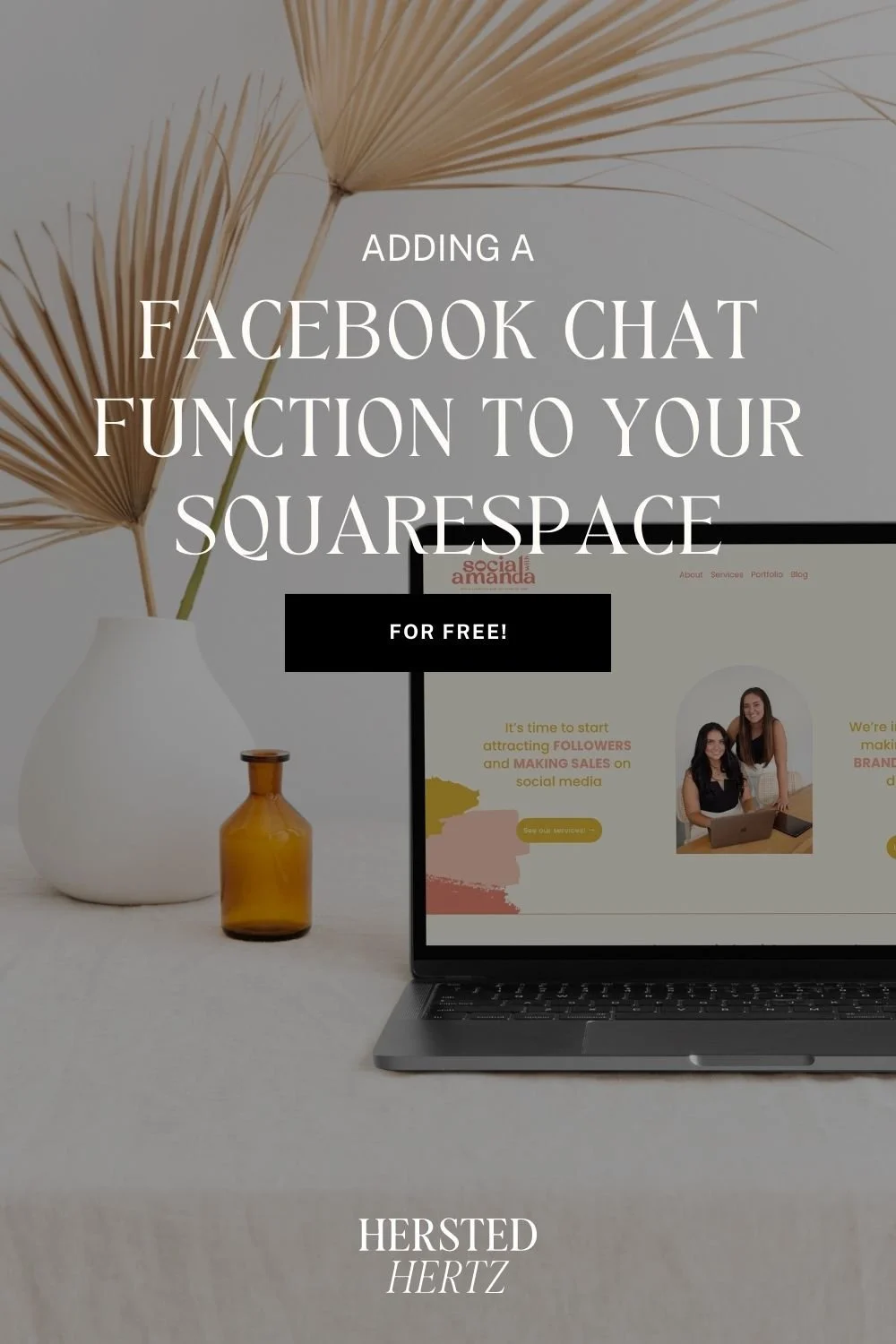
3 Website Footer Tricks That Can Help Your Business Grow [UPDATED 2023]

People spend lots of their time pampering their feet and painting their toenails even though it's the last thing people would notice. This goes the same way with the website footers literally; yes, it's the last thing your visitors will see on your website. Still, it should have a significant impact that will let your visitors know you're the real deal.
Your footer will serve as the Classic Nude Louboutin's in a boutique that everyone wants to have. Footers will let your visitors literally walk to your essential information.
So what's really important about a website footer that we dedicated a whole blog post about? A website footer aims to provide information and navigation options to tourists at the bottom of web pages.
Your website's footer is like the final flourish on a masterpiece; it might be the last thing visitors notice, but it should leave a lasting impression. The footer is where your essential information resides, serving as a guide for your audience. In this article, we'll explore three vital website footer strategies that can elevate your online presence and contribute to your business growth.
FOR YOU NOT TO GET LOST:
Let's now dwell on the 3 tricks on optimizing your Squarespace website footer.
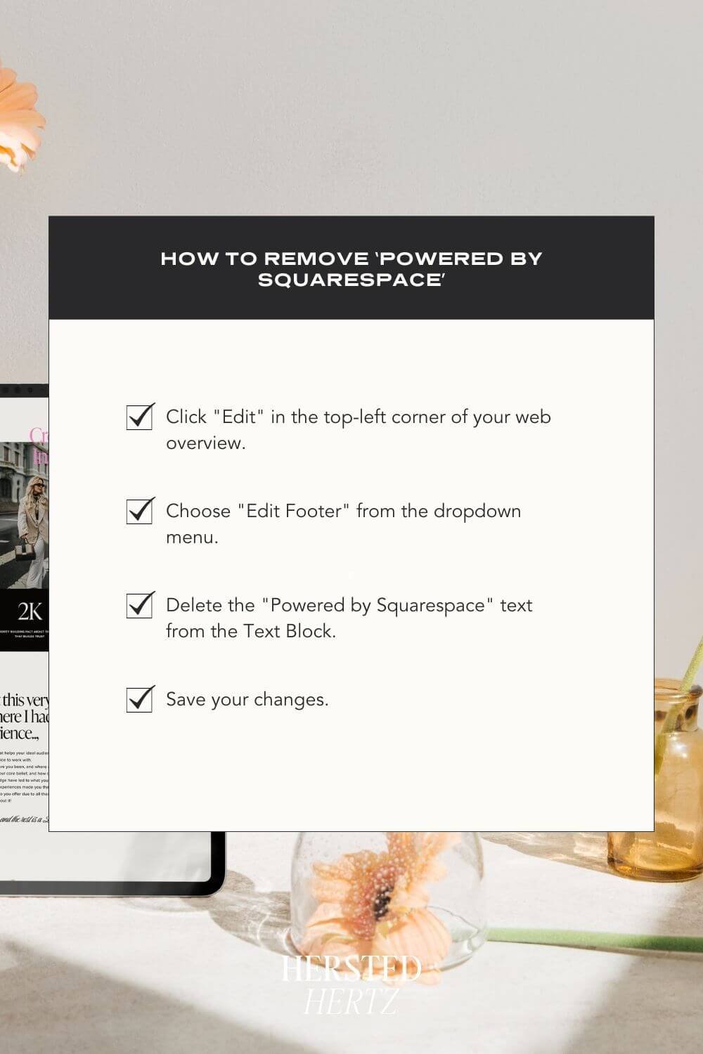
REMOVE ‘POWERED BY SQUARESPACE’
Okay, mic test, mic test. Now you're ready to let your website live. You've whipped up an eye-catching header, contents are booming, and you're prepared to show the world your blog. But, when you scrolled down, you saw 'Powered by Squarespace.' Not really appealing, right? The good news is that Squarespace heard you, and you can remove it.
Okay, so how to remove it?
Click "Edit" in the top-left corner of your web overview.
Choose "Edit Footer" from the dropdown menu.
Delete the "Powered by Squarespace" text from the Text Block.
Save your changes.
With this simple adjustment, you enhance the aesthetic appeal of your website.
2. Trim Irrelevant Content
I'll tell you a hard truth: Blog posts are only read 18% of the time. Visitors only skim and skip words and just looking for the information they searched for. Readers want that information as quick as they can, or else they'll get overwhelmed and just leave.
Okay, so why am I saying this? Because bloggers tend to put too much information in their website footers.
Blog post information + crowded website footer = Disaster!
Think of it like pairing an outfit: too many accessories can overwhelm the look. Similarly, an overloaded footer can deter visitors from exploring further. Focus on what's truly important:
Site Navigation: Include important links to guide visitors through your website.
Copyright: Protect your content by displaying a copyright notice.
Legal Pages: Ensure compliance with laws by including a privacy policy and other necessary legal pages.
Social Media Links: Connect with your audience outside your website.
Contact Information: Make it easy for visitors to reach you.
Consider these elements as the essential components of your footer, but remember, less is often more when it comes to keeping your brand in the spotlight.
3. MASTER THE ART OF WHAT TO INCLUDE IN YOUR WEBSITE FOOTER
As I said earlier, just keep the things that are worth keeping for your footer optimization. But, really, it depends on your website. I'm only here to lay out your options.
These are what you should include in your footer:
Site Navigation
Make sure to put all your important links that will lead your visitors to other parts of your website. You can use footer links for this.Copyright
Let your visitors know that copying anything on your website is protected. Adding copyright with your brand will make your website look legitimate.
Example: © Copyright and Design by Hersted HertzLegal Pages
It is vital to put a privacy policy in your footer since it is required by law. Other legal pages are also welcomed here.Social Media Links
Placing a social media icon is an excellent way for your visitors to connect to your brand outside your website.Contact Information and Address
By placing your contact information and address in your footer, you'll make it easier for your visitors to know your location.
These are what you may include in your footer:
Sitemap
Login form
Newsletter or Email Signup
Site Search Tool
About Us
SEO Keywords
Logo or Graphic Elements
Branding
Security and Credibility
Call-to-Action
Let me highlight some details above.
One tip is that this is your chance to showcase your branding. Just the right amount of all those elements will give you the branding the promotes your authenticity. Of course, the next important thing is maximizing the keywords for an SEO bump (but use text because Google doesn't want to overdo things like links). Who doesn't want some attention from our friend SEO, right?
Lastly, keep in mind that website footers are really small; proper contrast between color, fonts (simple typefaces, like sans serif), and weight is significant in readability.
I'll give you an example of a perfectly curated website footer (it’s the one from our Sienna Hale Template)

BONUS: FAQ
-
Yes, absolutely! Customization allows you to align your footer with your brand's unique style and message.
-
Yes, including a privacy policy in your footer is a legal requirement in many regions. Be sure to check your local regulations.
-
Focus on the essentials, such as navigation, contact information, and legal pages. Keep it clean and concise to avoid overwhelming your visitors.
It's not just aesthetically pleasing; but website’s footer also contains all the necessary information about the website. The font size, the color contrast, and the contents' placement are just right for the readers to catch everything. You'll be surprised that these minor details will make your readers visit every part of your website, that’s why footer optimization is a must!
LEARN MORE!
Super Easy Ways to Customize your Website Cookies and Why you need it
4 Ways to Make Visitors Love your 404-page in Squarespace + How to Customize it
Show your Visitors you are Serious - Why your Website Needs GDPR, Cookie, and Privacy Policy
4 Secret Tips for Buttons and Links in Squarespace + How to Add One
5 Places to Share your Social Media Links on your Squarespace Website
Website footer as your digital calling card
Congrats on reaching here. So here's our personal take on this whole website footer topic.
Did you know that brands saw up to 50% conversion rates when they aligned their footer design to their goals and branding? Enormous impact, right? Placing the right and most important information will let your visitors know about your website. It's like a calling card that allows your business partners to learn more about what you offer. You want your calling card as straightforward as possible but with the right aesthetic. Knowing that you put a lot of effort into making your website footer optimized as possible, people will take you seriously. That's a little secret to keep your brand known and successful.
Always remember to practice safe design. Your website footer shouldn't be crowded enough that the visitors feel that you're screaming to them by just reading it. Your website’s footer should show that it is your design in intelligence made visible. So what are you waiting for?
Get that best footer rock!
If you liked this post, Pin it to Pinterest!


For more information check out this post by Squarespace.